Paint Trends | Summer 2024
Let’s dive into the world of paint. What has and has not stuck around in the realm of paint predictions for 2024. What makes sense to incorporate in your own home and how to do so? The first thought that comes to mind are earth tones are here to stay, however on the flip side surprisingly bold punchy colors and muted colors have also made a big splash this past Spring for Interior Design.
Where the 2024 Paint Predictions Started
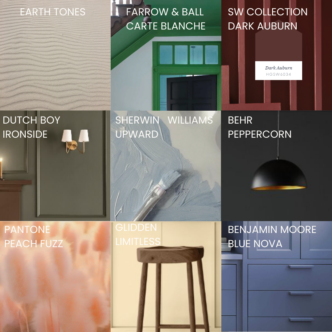
In January butter yellow started to become huge in the world of fashion and so there were predictions that this paint color would translate over into the Interior Design world. But, alas I have not seen much butter yellow come to fruition. It seems like a very very tricky color to design around and I think this might be why this paint color fell flat in the 2024 predictions. As for other 2024 paint colors, here is a breakdown of the color of the year by manufacturer from this new year.
Spring to Summer - Paint Colors that Stuck Around, What is Relevant?
Muted peachy pinks, warmer baby blue and silver under tones of a brighter blues, emerald paint colors, like burgundy and earth tones are the ones that peak the list as relevant paint colors for 2024. The three paint colors that stand out the strongest for the 2024 design trends are peachy pink, blues and earth tones leaning on the brown side of the spectrum. But, for those feeling even more bold burgundy is increasing in its popularity right now in the interior design world. Check out the examples below of the following paint colors being used in an absolutely stunning way!
This is a beautiful example of a peachy pink office design.
Photo from: Farrow & Ball - Sulking Room Pink
Make it stand out
By matching the cabinetry and trim with the wallpaper, it feels like an immersive design experience.
Wallpaper by: Sandberg
Rafael Light Blue
The rich burgundy paint color adds a bold pop in this wet bar. Design By: Alex Kaehler Design
What to Incorporate in Your Own Home and How to go About It?
Keep your neutral earthy tones in the main areas of your home like your living room and entry way. This will ignite a feeling of peace and calming nature about your home. With the exception of your kitchen, this is a space is perfect for adding color to your cabinets, walls, backsplash and more of your personality. By having the base of your home neutral, it makes it a lot easier to swap out colors you want to incorporate into your home by season or design trends.
As for bringing in the splash of color from the paint trends we discussed, the wine burgundy shade would look stunning in a half bath, laundry room or mudroom. For the blue and pink shades, they could also be used in the following spaces, but I would recommend using these shades more in a bedroom or an office with color drenching the doors, trim and ceiling with the exception of brining in fun wallpaper if that interests you.
Warm and earthy tones keep your space feeling cozy and inviting. Photo By: Dutch Boy
Color Drenching
Painting your ceiling, trim and doors help your space feel larger and more impactful from a design perspective.
Design By: Lindsey Gerber Interiors
By incorporating pops of color in your more neutral spaces, it will correlate nicely to the spaces you have done more of a color drenching moment. Design By: PocoDesigns
Using an earth tone like a sandy shade can act as a really great base for adding bold pops of color throughout your home. Design By: House Lift Design
Final Thoughts…
As the French say, Carte Blanche - meaning you are free to do whatever you want. I am really embracing Farrow & Balls approach to do what brings you joy and makes you happy. If you absolutely fall in love with a paint color, chances are you will still adore it just as much in 5 years. If not, you can always change it.


